CHEF!
September 16, 2026 CHEF! Day 4
Iteration 27
The Interface Gets CHEF!'s Look
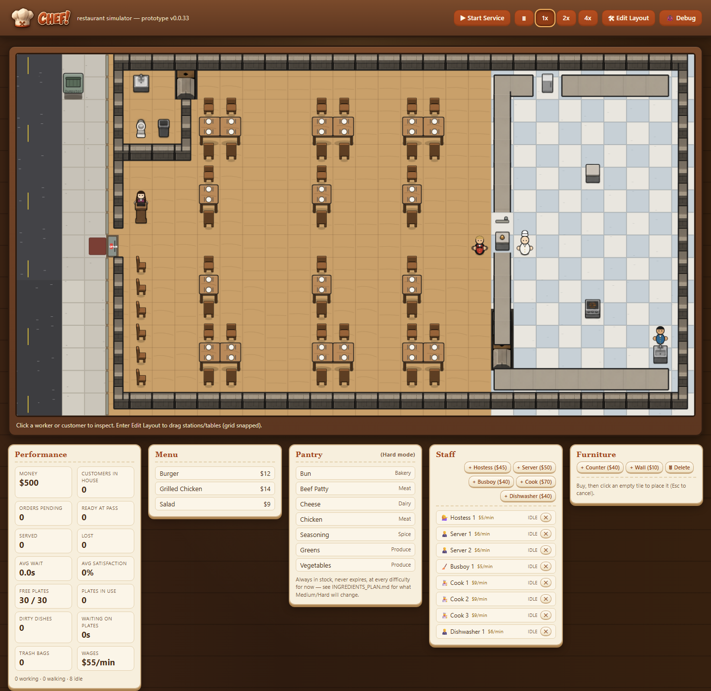
- The real CHEF! logo, from the Art Director's brand kit, replaces the magnifier and plain "CHEF!" text in the header, and the browser tab now shows the chef-hat favicon.
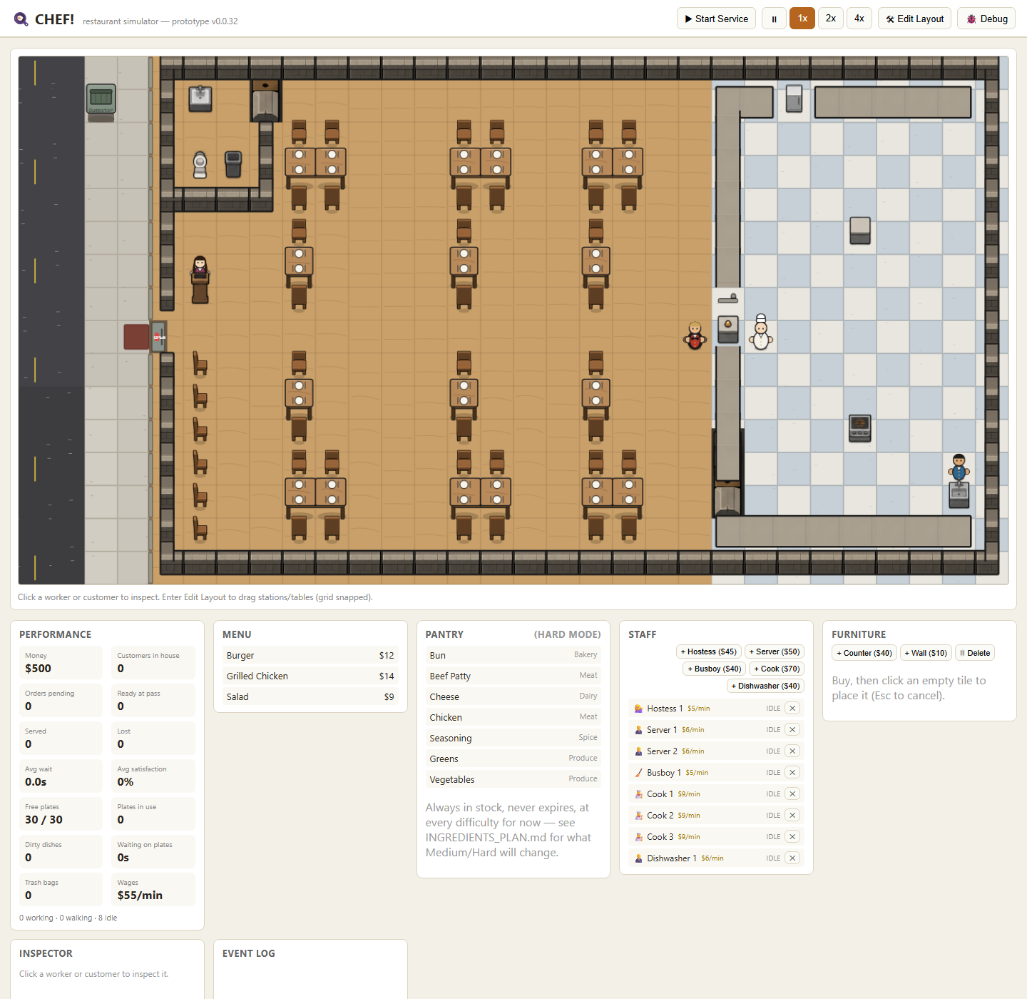
- The interface now looks like the concept art: a dark walnut backdrop with a warm lantern glow, a thick wooden frame around the restaurant, cream panels with terracotta Georgia headings, and chunky, rounded terracotta buttons. The event log is a slate chalkboard in a wooden frame, like the "Good Food" signs in the art.
- Everything follows the Art Director's CHEF! style guide: terracotta #B54E1F on light surfaces only, cream and dark-brown text, and no cold greys or plant green in the chrome.
- Long staff statuses such as "TAKING DISHES TO COUNTER" now stay on one line, so the whole eight-person crew fits in the staff list.
- Before and after, at desktop (1440px) and phone (390px) widths: 071/072 and 073/074.
More from CHEF! ·
See this in the live feed